The conversation is taking over the screen
The conversation is taking over the screen
AI
AI started as a chat box in the corner. Today, in some tools, it is the main view. I think the next step is that the conversation and the interface become one thing.
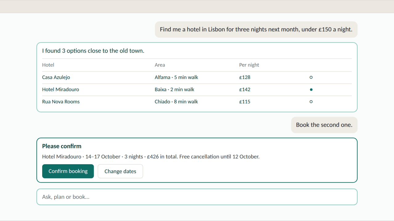
For most of the last twenty years, we designed screens, and most of them had the same structure: a layout, a navigation bar, buttons and forms, and users moved through them step by step to reach their goal. And then, overnight, AI arrived in our applications, and as a designer I started to see a clear pattern in how the screen is shared between the interface and the AI conversation. Even before the emergence of ChatGPT in 2022, the conversation started as a small box in the corner. Today, in some tools, it is the main view. I believe the next step is that the conversation and the interface will become one thing.
Stage 1: The helper in the corner
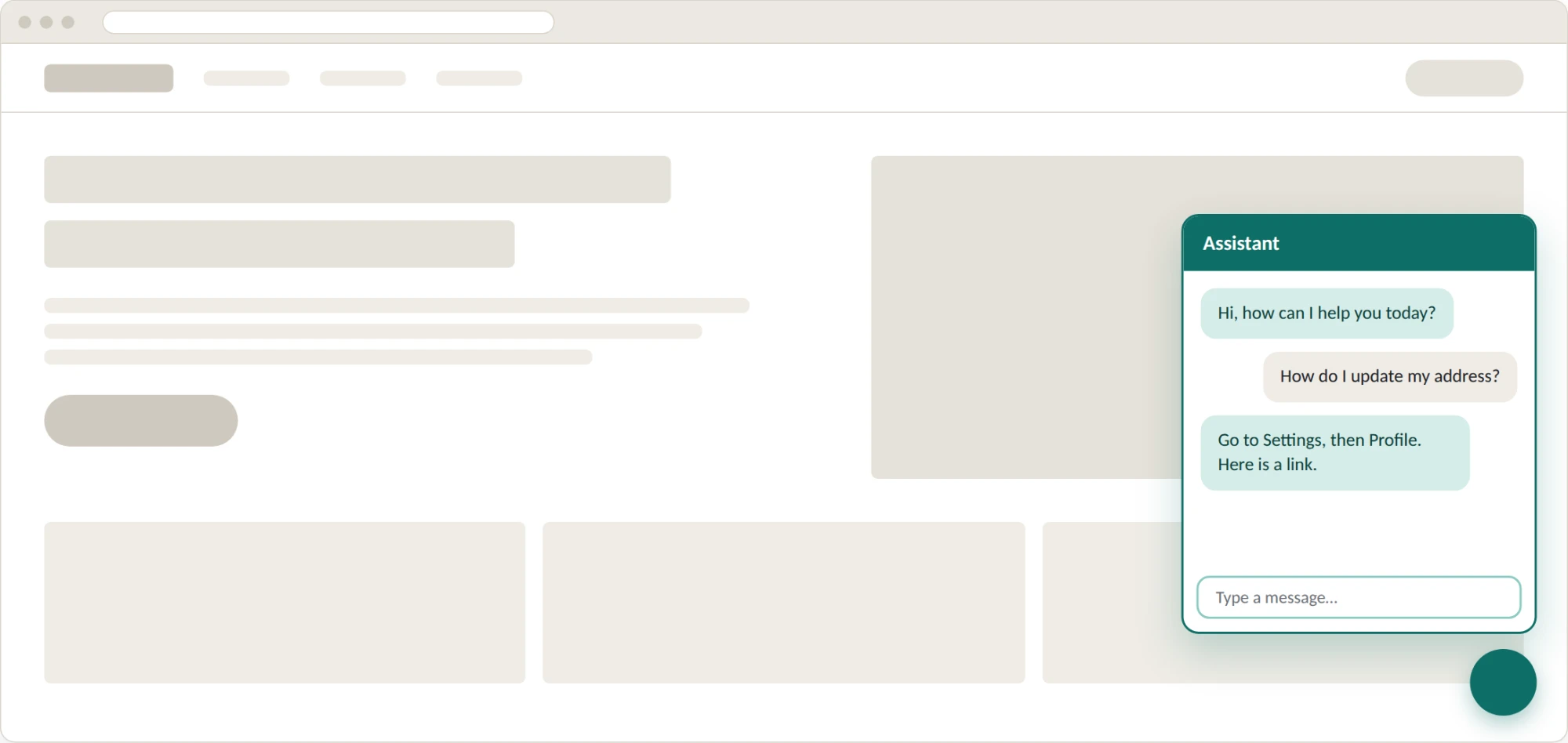
The AI helper expanding from the corner
At the beginning, when the AI assistant was mostly helpless, the website or app stayed exactly as it was, and a chat window opened from a small button in the bottom right corner. The AI website assistant could answer questions and share links, but it could not change the page or act on it. The conversation was a support channel sitting on top of whatever the product was, using about a tenth of the screen.
This made sense for a long time. Organisations could add AI without redesigning anything, and the risk was low because the AI mostly gave information. It also meant the AI was kept away from the real work.
Stage 2: The assistant in the sidebar
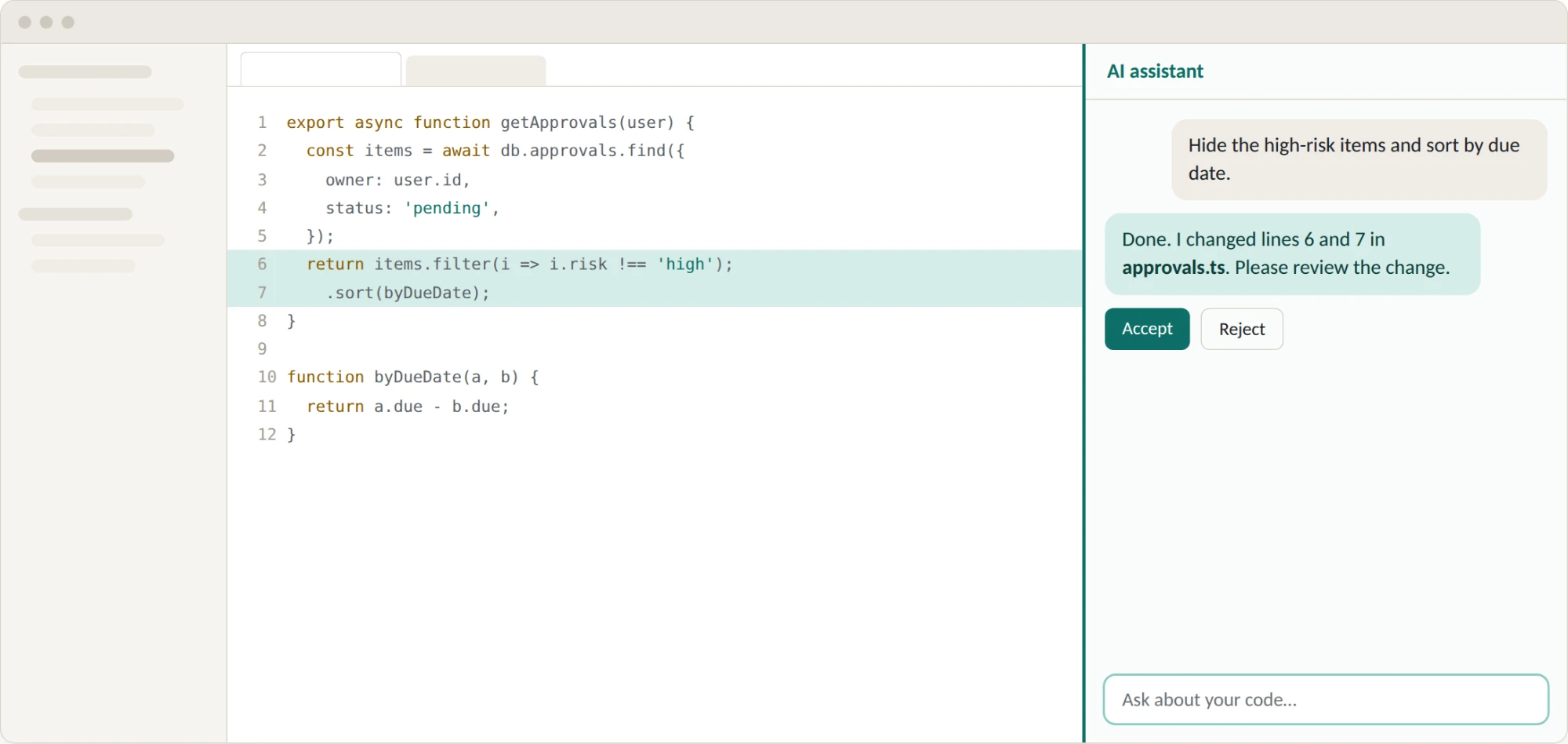
Code editors with integrated AI interface
First, code editors such as Cursor and GitHub Copilot changed this. The code stayed in the centre, and the AI moved into a panel on the side, using about a third of the screen. The important change was that the AI could now edit the work directly. It suggested changes, the developer saw them highlighted in the code, and the developer accepted or rejected them.
The human was still in control of the main view, and the screen real estate was given over to human review. The AI was like a colleague sitting next to you, but you were still the one holding the keyboard and making most of the decisions.
Stage 3: The conversation takes the centre
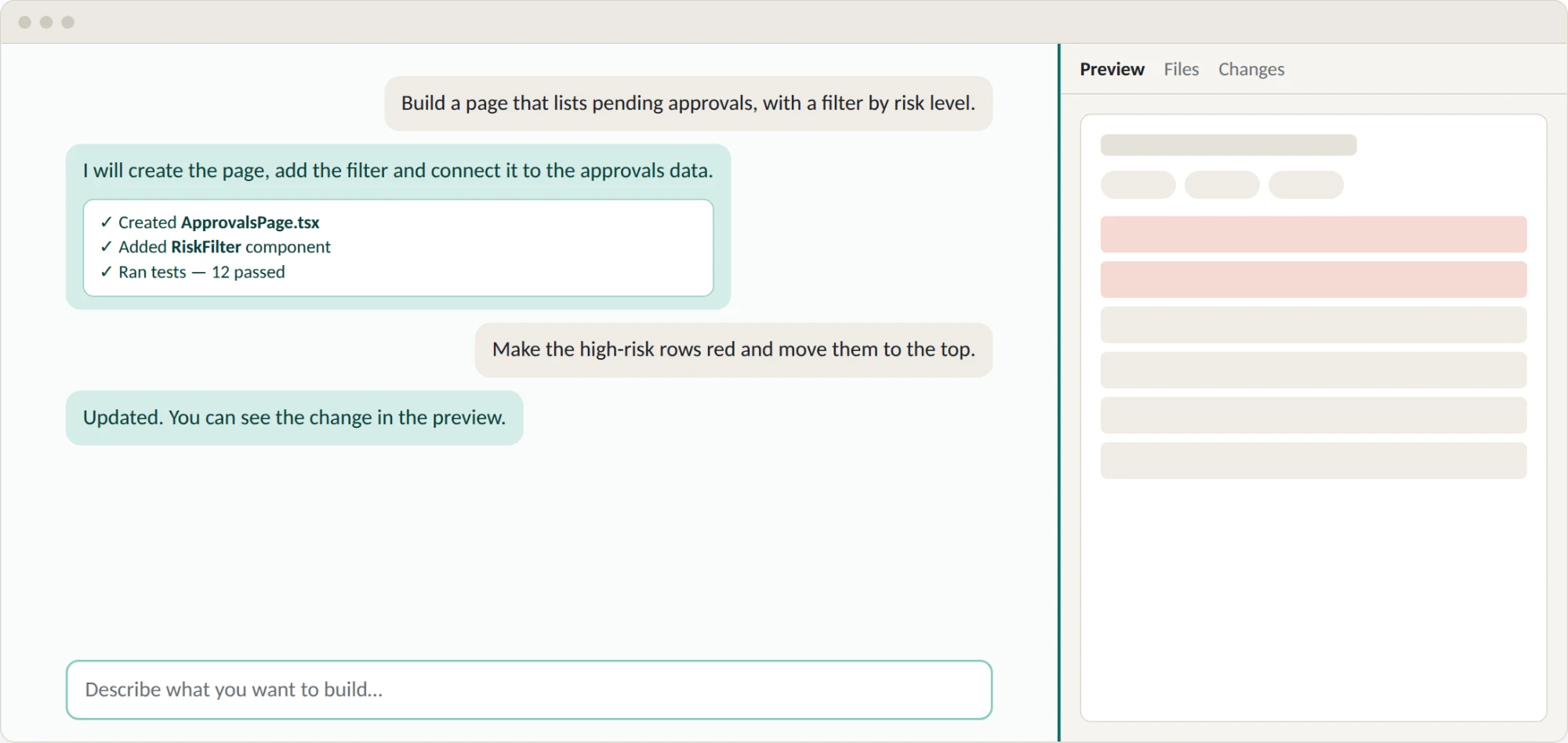
AI takes the main real estate
Then agentic tools such as Claude Code turned the layout around. For the first time, the conversation became the main window. The result of the work, meaning the code, the files and a preview of the app, moved into a smaller panel on the side.
For me, this was the first time the change in UI behaviour felt bigger. The user no longer works by editing things directly. They describe what they want, the agent does the work, and the user checks the result. The main activity moved from doing to directing and reviewing, and the layout followed that change.
Stage 4: The conversation becomes the interface
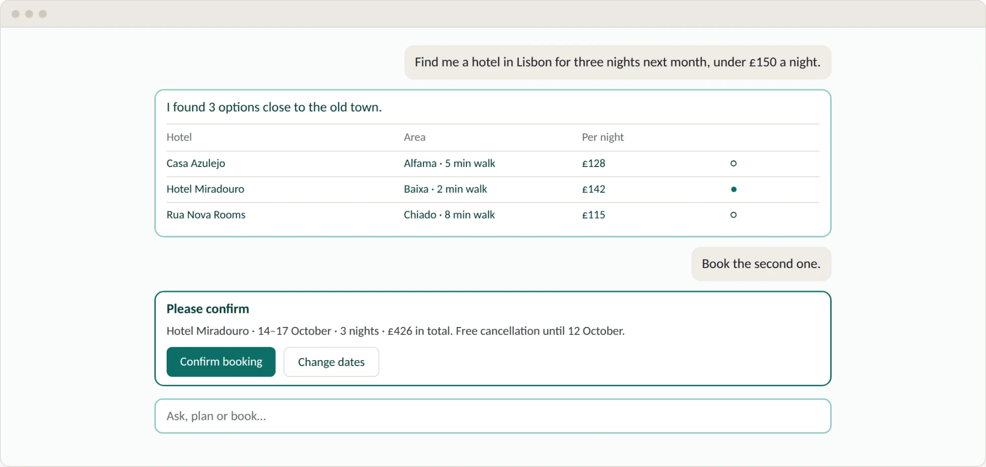
Conversations and interfaces will merge together
I believe the next step is that the side panel disappears. Instead of a fixed preview next to the conversation, the right interface component will appear inside the conversation when it is needed. You ask for your pending approvals, and a table appears. You ask to approve two of them, and a confirmation card appears with clear buttons. The interface is built for that moment, from the context of the conversation. This is often called generative UI, and early versions of it already exist.
At this stage, the conversation is no longer one part of the screen. It is the screen. My previous article covered this approach in more detail.
The line seems straight, but it's not
The direction seems like a straight line, but things are not that simple: every time the conversation grows, the work itself pushes back and asks for more space. We saw this when chat tools added separate canvases and preview panels next to the conversation. People need to see where things stand, and a long scrolling chat is not a good place for that.
So I do not think the end state is simply a bigger chat window. The conversation becomes the way we say what we want. The interface appears where a person needs to see something, make a decision or approve an action. The screen becomes smaller, but each part of it matters more.
As a designer, I feel like we are going through a major shift. But I don't need to explain that to you. If you are reading my article, whatever your job is, and unless you live under a rock, your job probably feels like it is going through a major shift as well. My job used to be designing pages. As the conversation takes over the screen, a designer's job moves towards designing the moments where a person and an AI agent meet: what the agent shows, what it asks, and where it must stop and wait for a human decision.